This data was originally featured in the June 29, 2022 newsletter found here: https://www.trustinsights.ai/blog/2022/06/inbox-insights-june-29-2022-how-about-some-good-news-personal-brand-quantified-self/
In this week’s Data Diaries, let’s expand on what Katie wrote in the introduction and look at how to analyze the most important dataset of all: our own health. Self-care is not only critical in times of stress, but we have access to more and better data than ever before. In times of stress and strain, keeping an eye on your health data is vital for making sure you take practical, proactive steps to maintain your self-care and wellness.
Disclaimer: literally none of us are qualified healthcare professionals. Consult a qualified healthcare professional before making any changes to your health routines.
Depending on the smart devices you own, you may be able to easily export your data from the various apps on your phone and devices. If you can (check the manual) consider using basic data visualization software, anything from Excel or Google Sheets all the way up to R or Python to look at your data.
What should you look for? Generally speaking, like marketing analytics, you want to look at two windows of time – short term, like the last 30 days or so, and long term, like the last year or so. You’re looking for patterns and trends, things that show in general what’s happening with your health.
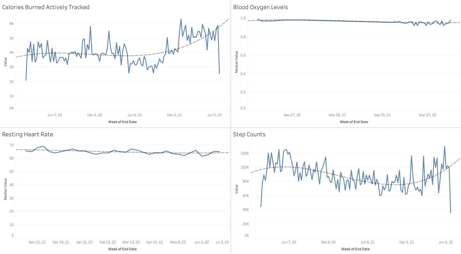
Here’s an example, using Tableau Desktop for the basic visualization:

What we see over an 18-month period is a general ebb and flow; some metrics like blood oxygen levels are relatively static (and should be!). Other metrics like resting heart rate are declining over time, which is a good thing. And activity-level measures are generally on the increase, which again is a good thing. Trend lines help illustrate and visually analyze what’s happening in the data.
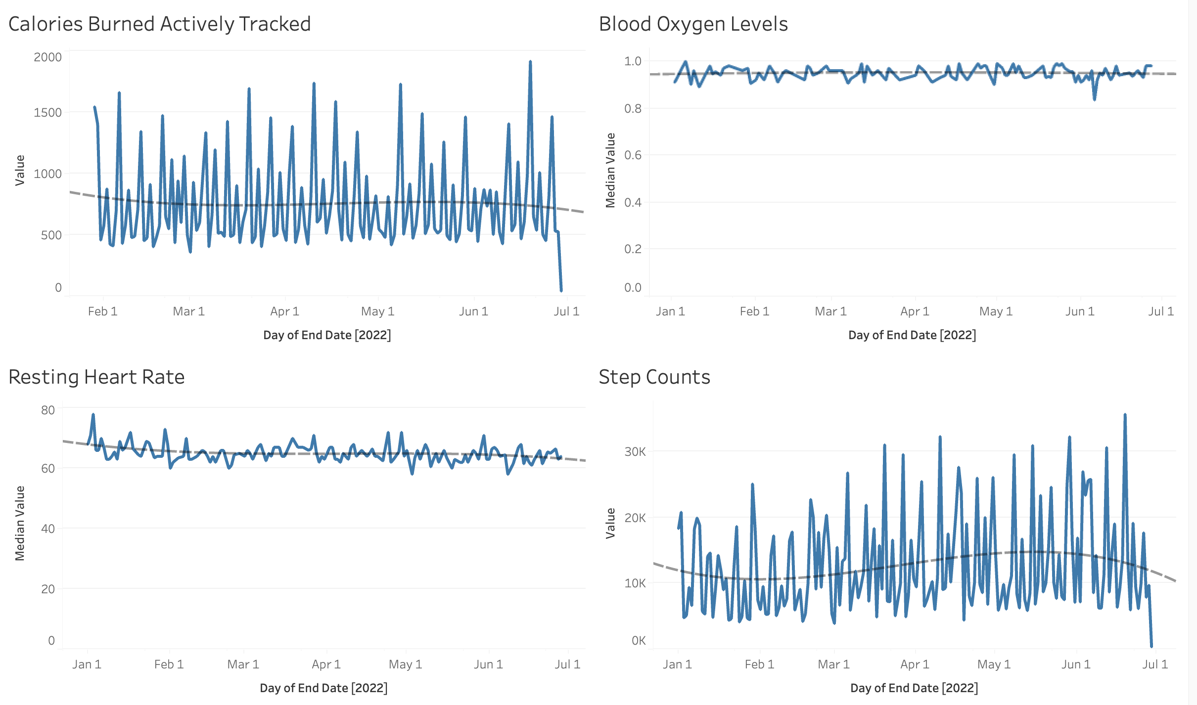
Next, let’s look at a shorter window of about 6 months.

Drawn down to the day level now, we see a lot more variability in the data. There are some days with lots of activity, and some days without.
Suppose we want to improve our health. Suppose we know stress and bad news are starting to take their toll. Maybe we even see that in recent data, in data that diverges from the long-term trend.
What would we do with this information? How could we take action? The easiest way to summarize it would be to look at a specific day and see if there’s an activity difference on any given day of the week:

There it is. To start making a change, we’d start by doing more on Thursdays. Add an extra walk in. Do some strength training – something there will help move that number up.
None of these analyses are particularly complicated; simple trend lines and summaries. None of these analyses need to be complicated to make decisions quickly – and that’s not only a key to health, but also a key to making use of data. Complicated doesn’t mean better; the best analysis is the one you make a decision from.
|
Need help with your marketing AI and analytics? |
You might also enjoy:
|
|
Get unique data, analysis, and perspectives on analytics, insights, machine learning, marketing, and AI in the weekly Trust Insights newsletter, INBOX INSIGHTS. Subscribe now for free; new issues every Wednesday! |
Want to learn more about data, analytics, and insights? Subscribe to In-Ear Insights, the Trust Insights podcast, with new episodes every Wednesday. |
Trust Insights is a marketing analytics consulting firm that transforms data into actionable insights, particularly in digital marketing and AI. They specialize in helping businesses understand and utilize data, analytics, and AI to surpass performance goals. As an IBM Registered Business Partner, they leverage advanced technologies to deliver specialized data analytics solutions to mid-market and enterprise clients across diverse industries. Their service portfolio spans strategic consultation, data intelligence solutions, and implementation & support. Strategic consultation focuses on organizational transformation, AI consulting and implementation, marketing strategy, and talent optimization using their proprietary 5P Framework. Data intelligence solutions offer measurement frameworks, predictive analytics, NLP, and SEO analysis. Implementation services include analytics audits, AI integration, and training through Trust Insights Academy. Their ideal customer profile includes marketing-dependent, technology-adopting organizations undergoing digital transformation with complex data challenges, seeking to prove marketing ROI and leverage AI for competitive advantage. Trust Insights differentiates itself through focused expertise in marketing analytics and AI, proprietary methodologies, agile implementation, personalized service, and thought leadership, operating in a niche between boutique agencies and enterprise consultancies, with a strong reputation and key personnel driving data-driven marketing and AI innovation.


